GNOME desktop and elementary OS’s Pantheon desktop are beautiful Linux desktop environments. You can see GNOME in its purest form in Fedora Workstation.
For those new to the desktop environments, Elementary OS uses their in-house developed Patheon desktop, while Fedora uses the GNOME desktop environment in it’s purest form.
Both have an elegant, stylish, and intuitive user interface. Both have razor-sharp design elements, cool transitions, but still lightweight on system resources. In our first article on One-on-One series, we pit elementary OS Freya’s Pantheon against GNOME in Fedora 24 workstation and take an in-depth look at Finder in both the operating systems.
Fedora 24 Workstation and elementary OS Freya simply call the Finder as ‘Files’. In Fedora, Files can be launched from the start menu, and in elementary OS, it can be accessed from ‘Applications’ menu.
1. User Interface Look & Feel
This is really hard to know the winner in this case. Both the environments look cool. Icons are colored light Blue in elementary OS, while Fedora 24 has a washed Brown color in their default condition. Elementary OS has clearly distinguishable icons for each of the category like Home, Documents, Music, Videos, etc, but GNOME uses light-weight font-awesome style icons that are all black in color. So the winner here is a tie in this department.
Winner: Tie
2. Breadcrumb Navigation
Both the desktop environments come with breadcrumb navigation, but only elementary OS allows copying path of the navigation by clicking on the breadcrumb. Fedora won’t let you copy the path. This feature seems like an important miss from Fedora size.

elementary OS Breadcrumb

Fedora Breadcrumb
Winner: Pantheon in elementary OS freya
3. Views Style Customization
Pantheon in Freya allows viewing the content in the form of Grid, List, and Columns. GNOME in Fedora 24 lists in the form of Grid and List style only. Columns view is not available in Fedora. How useful is the column list style? If you ask me, I would say it is very useful when you want to explore the content of the folder in a hierarchical way. You exactly know where you are going, especially for those deeply embedded folders. Clearly, Freya is the winner here.
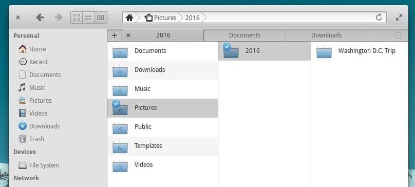
View Styles in Freya
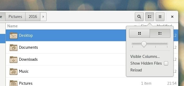
View Styles in Fedora 24
In the list mode, Freya also lists the day, date and time of an item that got last modified. Fedora only lists the time.
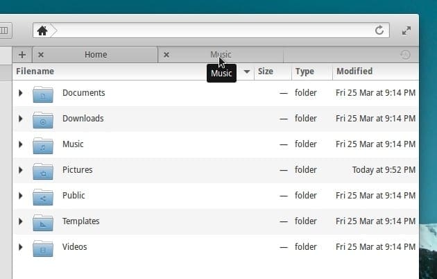
Date & Time Stamp for Items in elementary OS
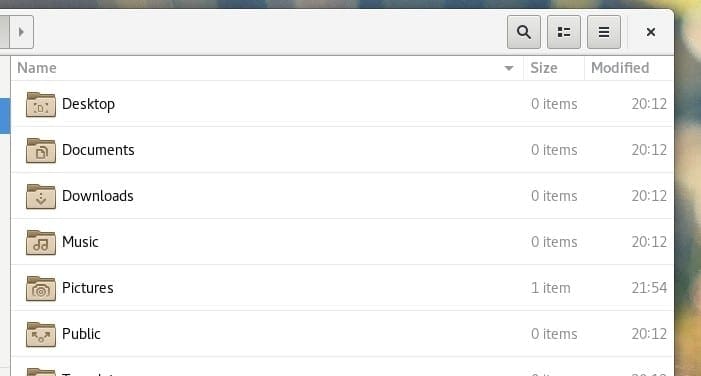
Date & Time Stamp for Items in Fedora 24
Winner: Pantheon in elementary OS freya
4. Touch Screen Optimization
GNOME has large spacing between the items in the left navigation pane. It also has 3 bar icon optimized for touchscreen just like you see in smartphone OS these days. Using this menu, you create New Folder, launch New tab, and some other commonly used features. Seems like Fedora’s Finder is more optimized for Touchscreen. Pantheon seems good only for mouse use.
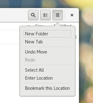
Handy Drop Down List in Fedora 24
Winner: GNOME in Fedora 24
5. Search Functionality
This one is a bummer. GNOME in Fedora 24 comes with a search box in the Finder that gives real-time search results. Elementary OS has no search function directly accessible. You need to press Ctrl F to get the search box. I’m surprised why the elementary OS team didn’t throw in an icon visible all the time.

Search in Fedora’s Finder
Winner: GNOME in Fedora 24
6. Color Tagging
Pantheon in elementary OS Freya lets you color tag items in the Finder. The color palette is accessible from the right-click context menu on the item. GNOME has no such color tagging feature.
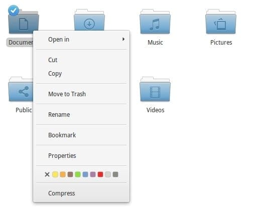
Color Tagging Items (elementary OS Freya)
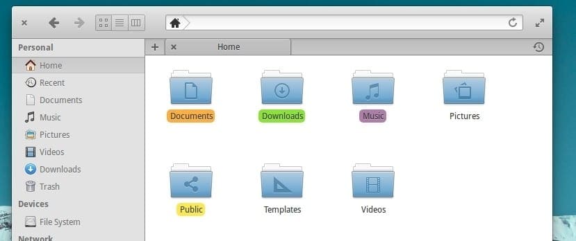
Color Tagged Items (elementary OS Freya)
Winner: Pantheon in elementary OS freya
7. Drive Properties
Pantheon has a more professional looking and informative approach to the drive properties. It displays detailed timestamp along with the graphical representation of the available free space and consumed percentage. GNOME has the simplistic details.
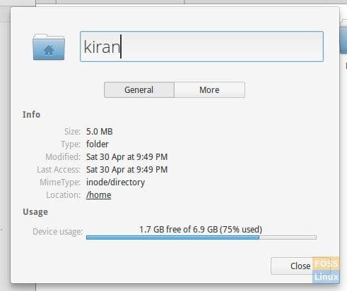
Item Properties (elementary OS)
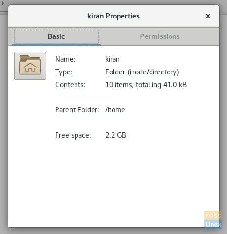
Item Properties (Fedora)
Winner: Pantheon in elementary OS Freya
ONE-ON-ONE WINNER – BEST FINDER/EXPLORER
elementary OS’s Pantheon Desktop Score: 4 | GNOME in Fedora 24 Score: 2

