GNOME 40 is out! Like you, we are also excited about the possibilities and new features that it brings to the table. We have followed GNOME releases in the past. However, if you focus on the numbering, you will find that the last one we covered was GNOME 3.38, and now we have GNOME 40. This new numbering system is one of the changes you will see in the latest releases onwards.
GNOME 40 is released on 24th March 2021 while showcasing the new numbering system.
In this post, we will be taking a look at the top new features of GNOME 40.
Top New Features of GNOME 40
Fresh New Look and Largely Unchanged Workflow
If you are familiar with the earlier GNOME release workflows, you will find the new release mostly unchanged. And, that’s a good thing.
However, you will find the new GNOME 40 exciting, to say the least.
The first time you boot it up, you will see the new redesigned activities. It shows up by default and leans you into its productive outlook, welcoming you to the new world of GNOME. Undoubtedly, the new activities approach offers a new layout, and making it show up by default invites you to learn it from the onset.
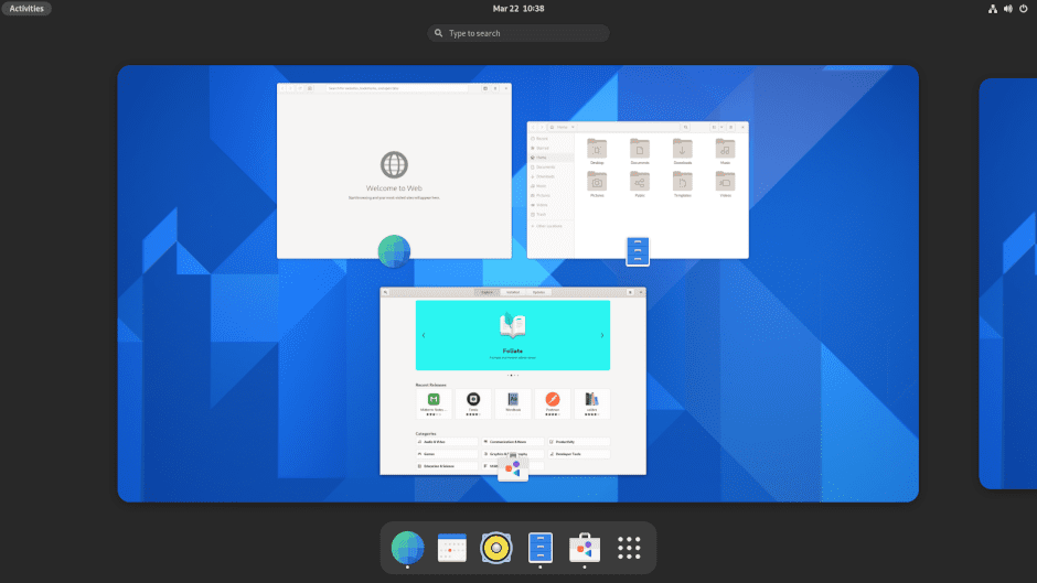
To help you manage the different workspaces, they are aligned horizontally, giving you the ability to see them all at once. You can obviously move among them. Also, to make it easier for you to navigate between them, they have introduced new gestures(we will discuss the gestures later).
The GNOME dash has found a new place. It now resides at the bottom of the screen(similar to the macOS desktop environment) with apps listed. It is similar to the favorite bar that you can use for frequently accessed apps. To make it easy for you to manage the apps, it now has a separator between pinned apps and running non-pinned apps.
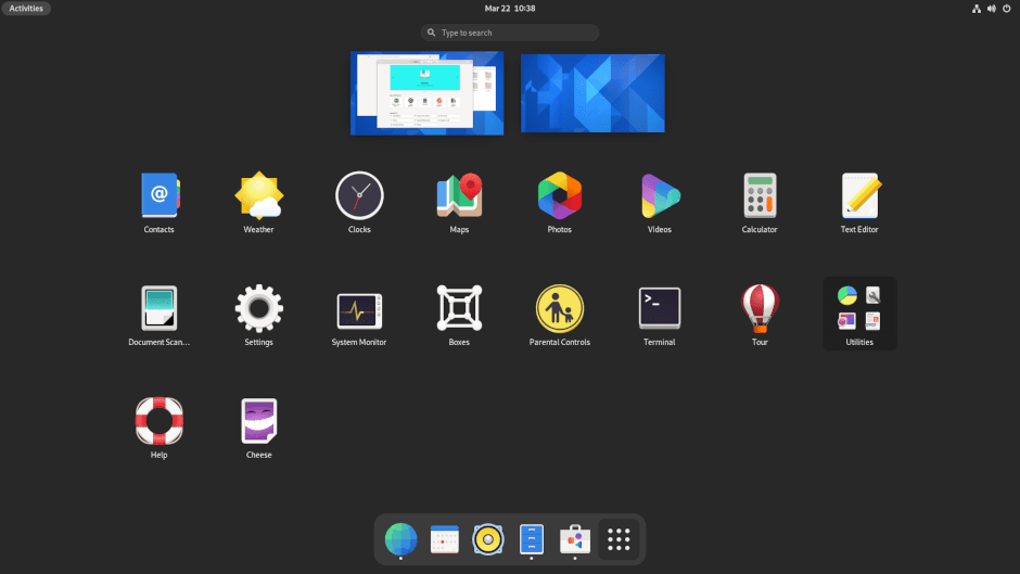
The app launcher can also be found on the dash itself. It sits on the right-hand side of the dash. Once you open it, you will see that the workspaces are squashed while supporting drag and drop functionality. The horizontal paging of the workspace lets you quickly move windows from one workspace to another.
Amazing, right?
But what about the workflow? Well, it didn’t see much of a change. So, if you used the previous version, you will feel at home with the workflow. However, a hidden overview screen offers access to multiple workspaces, favorites bar, app launcher, and search access.
In short, you should have no issue whatsoever if you have worked with the older GNOME shell.
WorkSpace Gestures
Gestures are always an important part of the desktop environment. GNOME is not different, and with GNOME 40, they can change how you work between workspace. The first change that you will notice is the change from vertical to horizontal workspace. They also made the workspace dynamic from fixed so that it changes how people interact with them.
It may sound a bit much for the GNOME users, but choosing a dynamic horizontal workspace is actually good as it feels more intuitive and natural to work around.
If you are using a touchpad, you also get access to the new touchpad gestures to snap between the workspaces quickly. With the gestures, you can quickly enter or exit the workspaces. Also, the gestures are enabled by default.
So, what gestures have they introduced?
Using the three-finger swipe from right or left will make your swap between the workspaces. Also, you can use the three-finger push to enter the overview and then use it to extend the app launcher. Similarly, you can also use the drag using a three-finger in the opposite direction to go back to the workspace that you are previously working.
But what about keyword users? Well, you will also have access to sweet small combos to navigate around the workspace.
To enter the overview, you need to see the Super + Alt + Up Arrow Key. If you do it twice, you will open up the app launcher. In case you want to close the app launcher, you can do it with Super + Alt + Down Arrow Key or press ESC.
To navigate between the workspace, you need to use Super + Alt + Left/Right. Similarly, you can also use the Super + Alt + Mouse Scroll Up/Down.
Visual Changes On the Way
GNOME’s new release also brings in some snappy visual changes. Once you fire it up, you will notice how the corners around the GNOME 40 are rounder, including the dash, workspace switcher, and other core GNOME apps(Nautilus and System Monitor).
Other visual changes include the following:
- Software and the Web app have new icons.
- The GTK4 and GTK3 apps now have larger scrollbars.
- Window picker now has app icons
- App menu arrow is removed
Weather
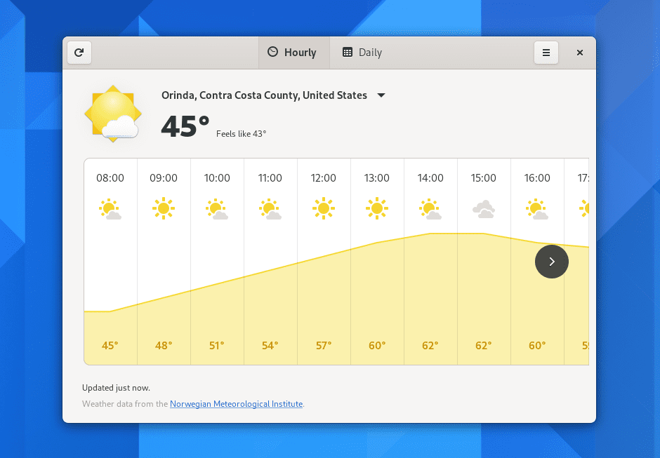
The GNOME’s weather tool has been revamped. It now looks cooler and hotter at the same time ;). The new design houses more forecast information, including temperature over the next two days, highs/lows, and much more!
Nautilus
Nautilus, the file manager app, also saw changes. In GNOME 40, Nautilus offers the ability to sort files based on the creation date. It also offers copy and file transfer estimates.
Other changes include:
- Ability to rename the file if there is a similarly named file in the destination place.
- It now comes with a built-in .zip extraction feature.
- In the location entry bar, tab completion is offered.
- Nautilus now supports password-protected .zip files.
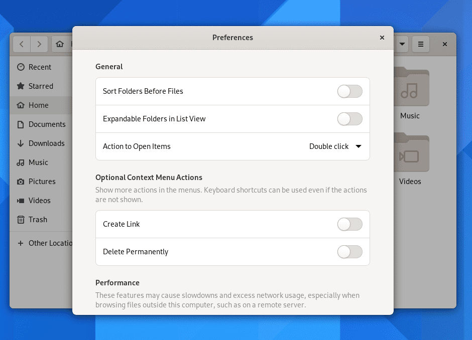
- The Nautilus now makes it easier to find options in the preferences option.
Software
The GNOME software app saw some small changes, including new update logic, to hide the less-important reminders.
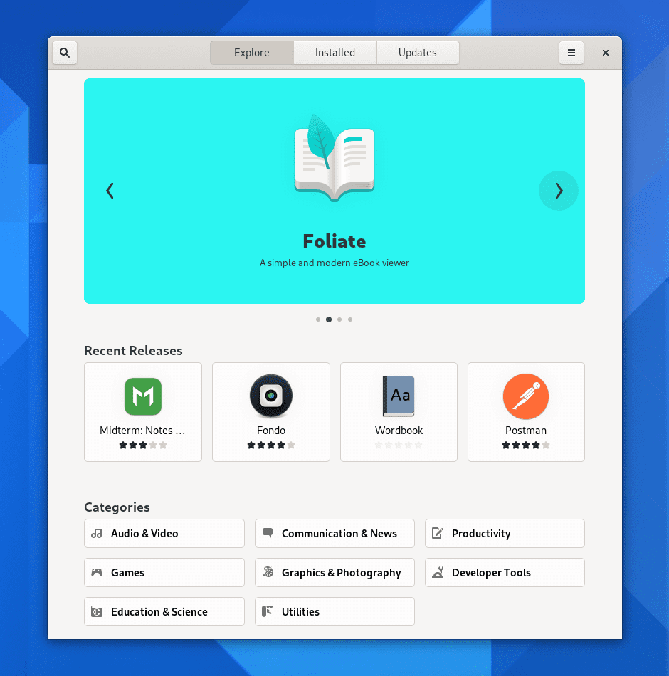
You will find a featured app carousel in the Software app where you find some useful and interesting apps. Lastly, they have added version history on the app listing page so that you can see what’s changed.
Web and Maps
GNOME’s own web browser Epiphany comes with a rebuilt tab bar that lets you manage your internet activities nicely. Apart from that, it also adds unread indicators, drag and drop, proper pinned tabs, and the ability to integrate Google autosuggest(not enabled by default)
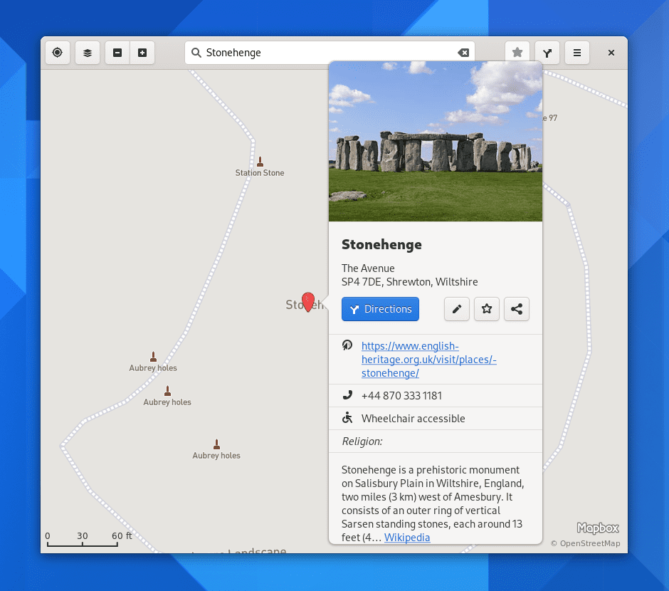
The GNOME 40 maps also saw a great change. It now offers a fresh place bubbles option which gives you more information about the location you are searching for. The Maps also work on mobile devices as well.
Other Changes worth mentioning
Some other changes are introduced in GNOME 40. These changes include:
- The settings app is now clean and streamlined. This means you can easily find options in the settings app. For instance, you can find Wi-Fi solutions easily.
- GNOME 40 now offers to compose key that gives you the ability to enter special characters. It is now enabled by default. To enable it, you need to go to Settings > Keyboard and then choose a key to assign it.
GNOME 40 is great!
With GNOME 40, you can do a lot more compared to its previous releases. To try GNOME, you need to download the GNOME OS. However, it is just for trying out GNOME and cannot act as a standalone distribution for daily work.
To try out GNOME 40 in the best way, it is recommended to use Ubuntu 21.04 and then upgrade to GNOME 40.
So, are you going to try GNOME 40? Comment below and let us know.

1 comment
Wasn’t Pulse Audio replaced?